Introduction to R: Plotting
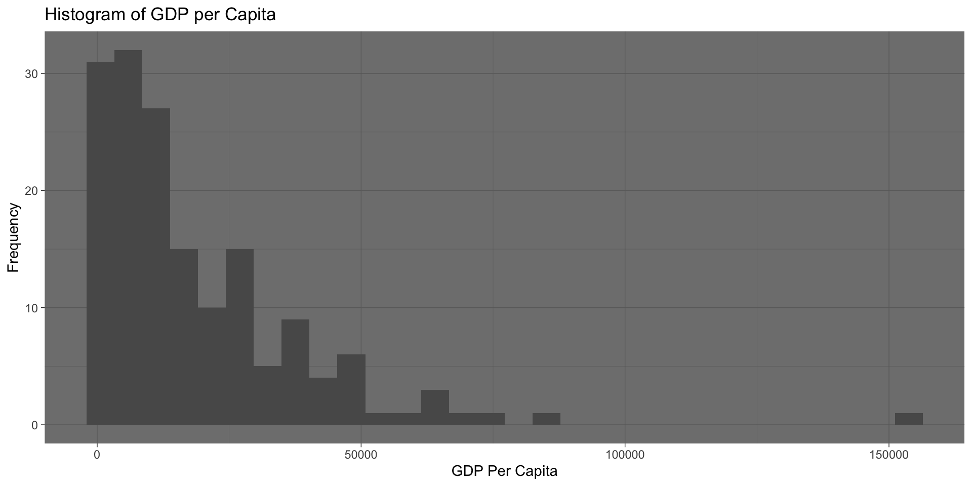
Simple Plot
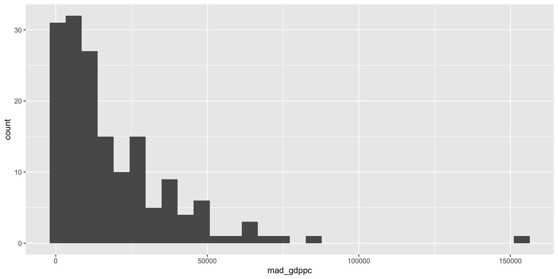
Setting the data frame we are accessing
Identifying that we are going to use mad_gdppc as the x variable by using the aes() within ggplot()
Displaying that data as a histogram by adding geom_histogram()
Remember things are linked together with +
Modifying the Style and Labels
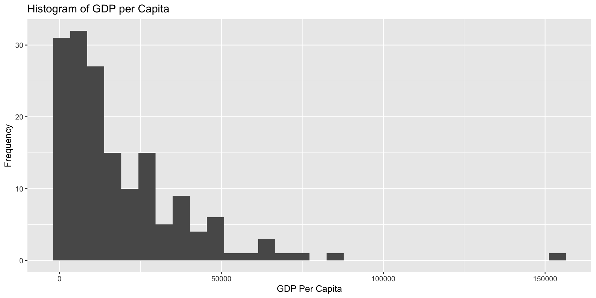
Themes
ggplot has a large number of themes that you can use to change the style of your plot.
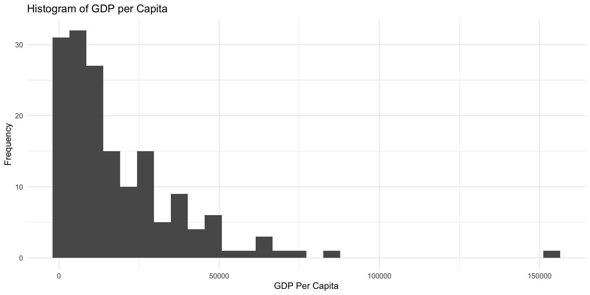
Different Theme
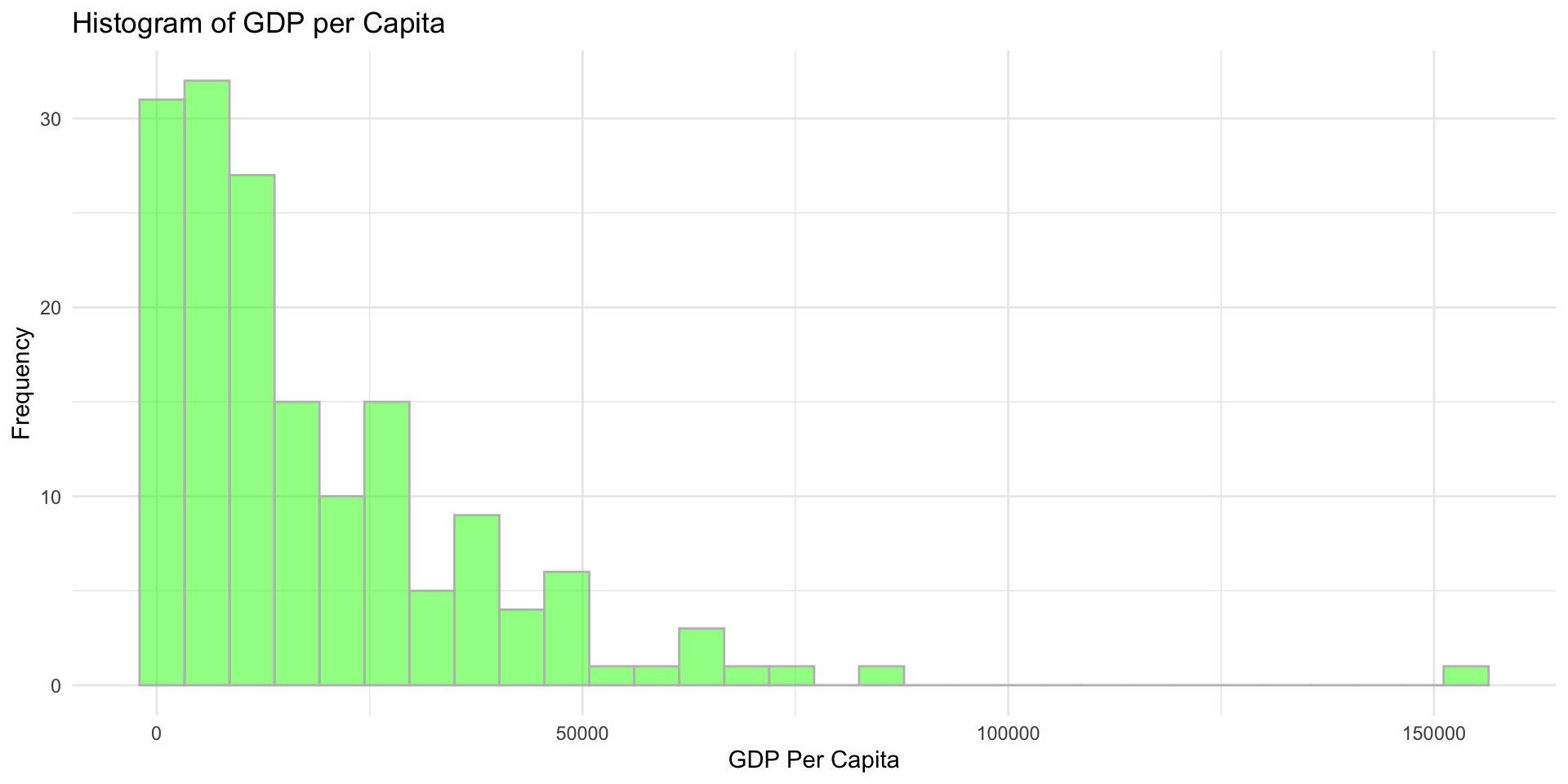
Adding more Aesthetics
We can also modify the color and transparency of the bars to specific values by adding them to the geom_histogram() call
My Answer

Saving a Plot in R
Before going further it is helpful to know that you can save your plot (p <-) and then add more things to it:

Modifying a Plot
We can then try out other things more easily:
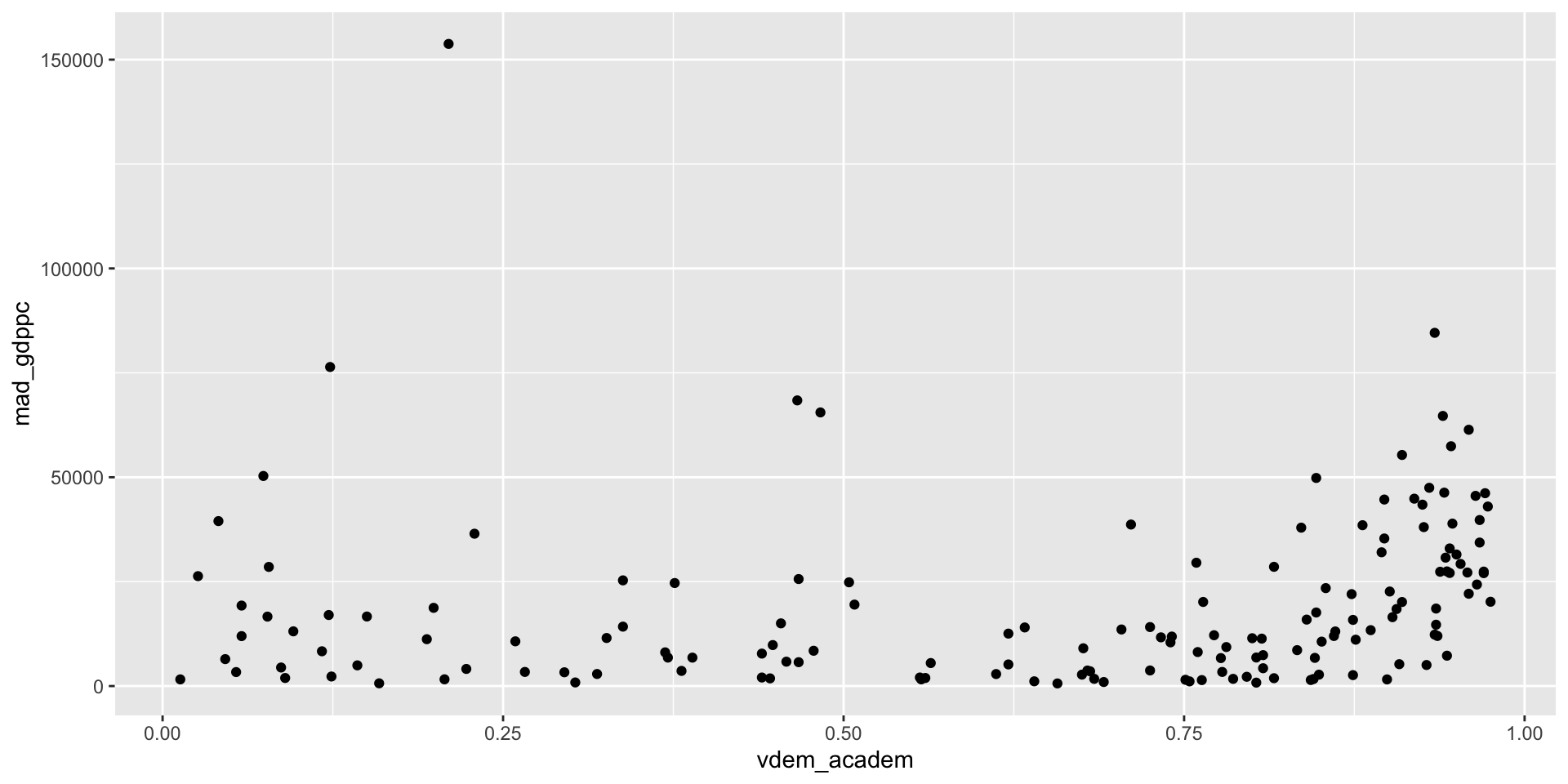
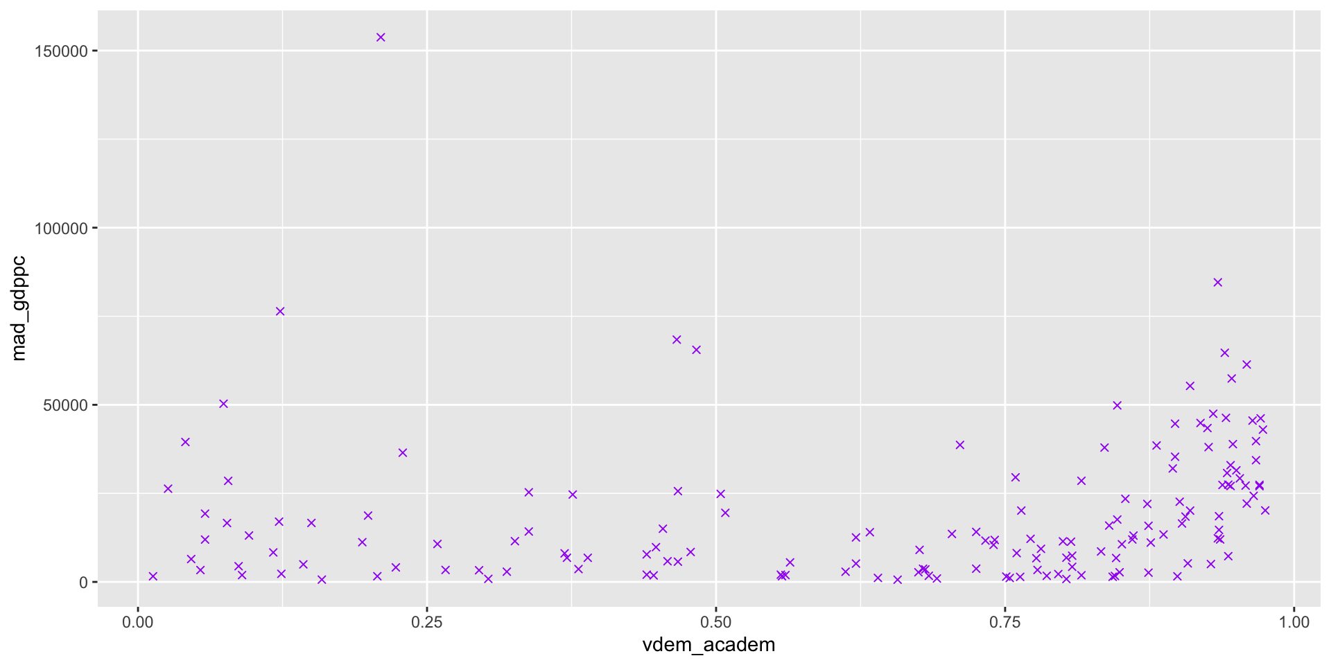
Scatter Plots
geom_point() is going to plot points at the x and y value you that you give it:
Aesthetics Example
Aesthetics with Other Variables
We can also set any of these aesthetics to reflect another variable
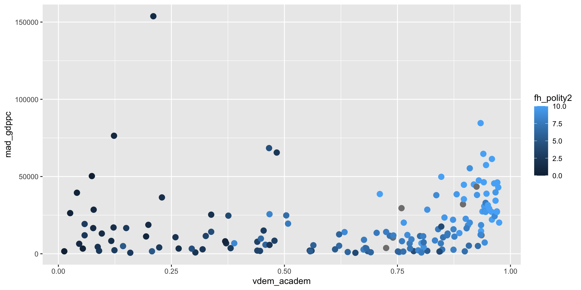
We have a new label to fix.
Scales and Guides
Each aesthetics has associated functions that can be used to modify the scale it uses. scale_color_gradient() switches the colors to a gradient defined by a high color and a low color.
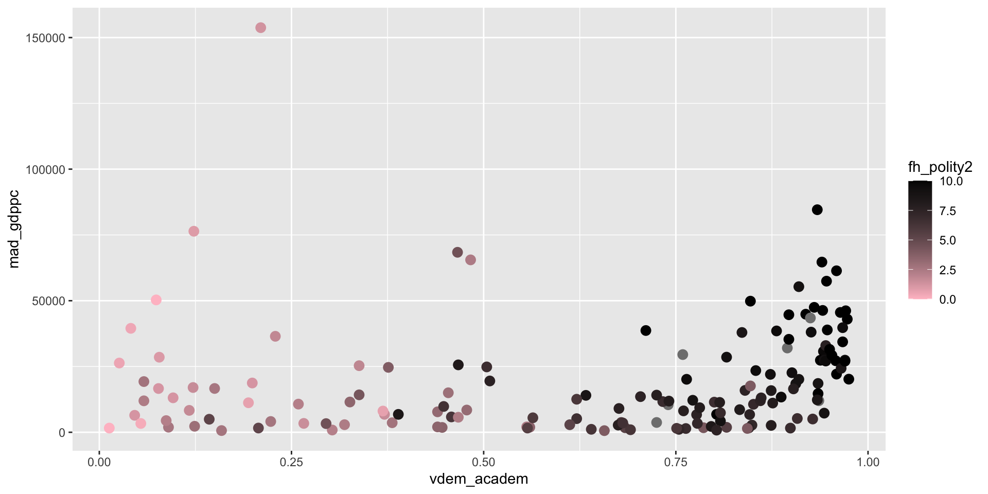
Scales and Guides Labels
The scale_*_*() variables all take a name argument as well, that is the first thing it expects so you can just put it in the first.
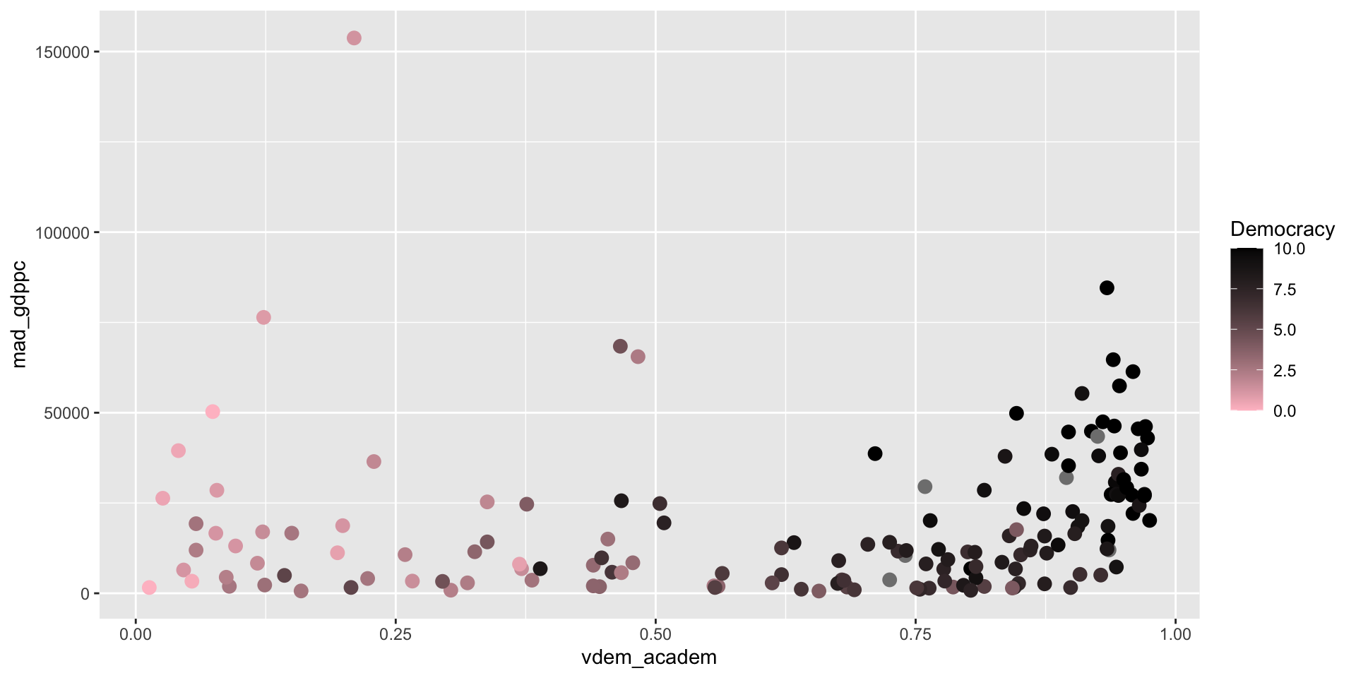
Adding More Scales
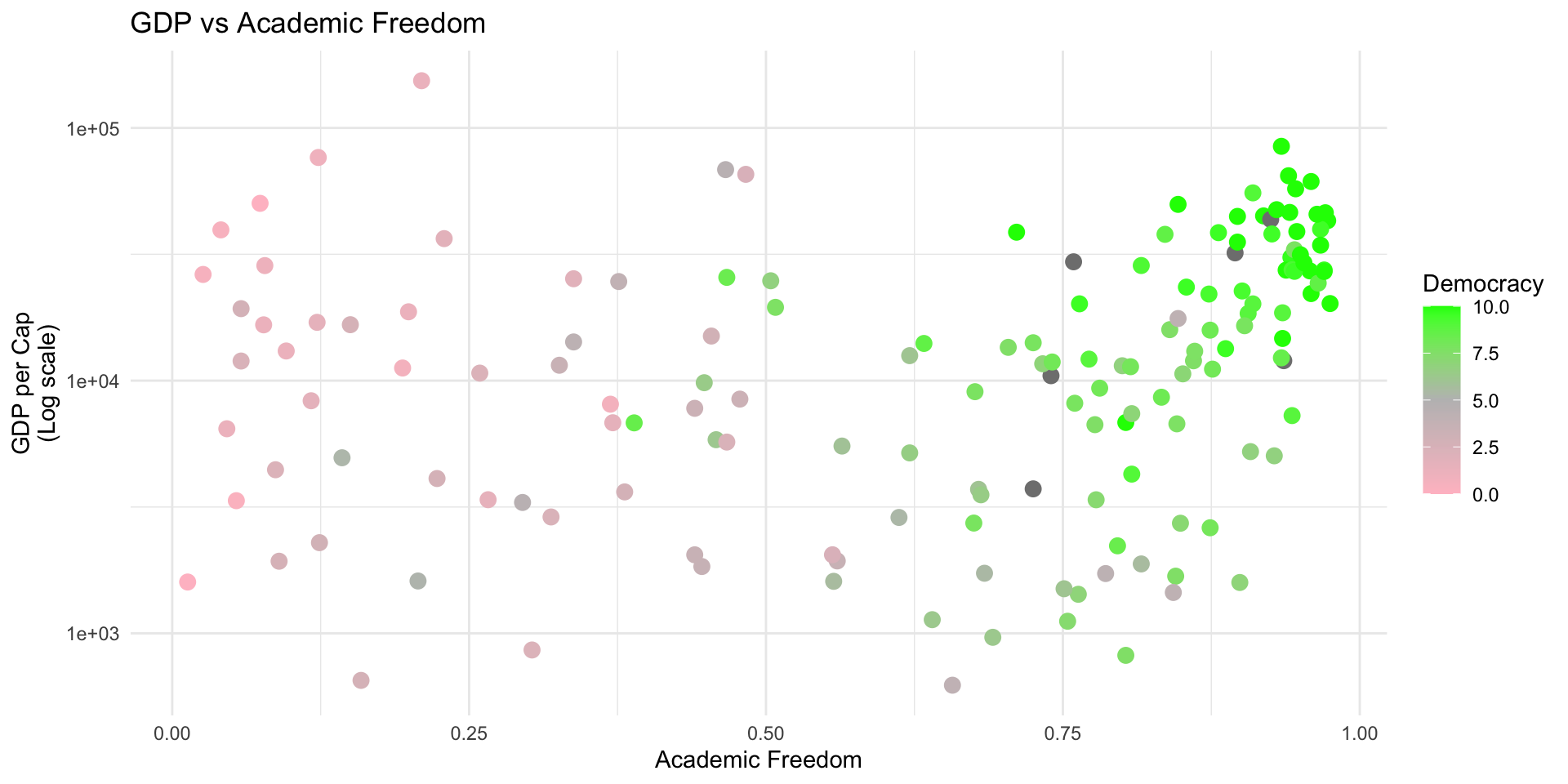
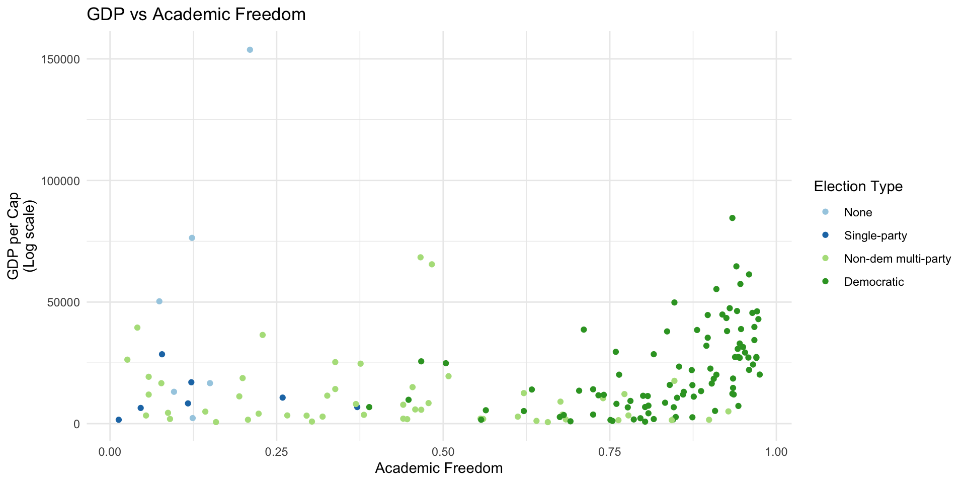
Example
df %>% filter(!is.na(br_elect)) %>%
    mutate(br_elect_label = factor(br_elect, levels=c(0, 1, 2, 3),
        labels=c("None", "Single-party", "Non-dem multi-party", "Democratic"))) %>%
ggplot(aes(x=vdem_academ, y=mad_gdppc, color=br_elect_label)) +
geom_point() +
scale_color_brewer("Election Type", type="qual", palette = 3) +theme_minimal() +
labs(y="GDP per Cap\n(Log scale)", x="Academic Freedom",
title="GDP vs Academic Freedom")