This uses BERTopic to analyze open ended responses from the 2020 ANES. I am starting with V201109 which asks individuals “What is it that [respondent] dislikes about Democratic Presidential candidate? (Joe Biden)?” (At the end there are a few other examples). I am not an expert in machine learning but this will hopefully help identify how this works (and help me better understand it as well)
Loading and Cleaning Data
We start by loading and cleaning the data. Unlike other text analysis methods, we don’t want to do any sort of stemming or cleaning. Instead we want the whole text as it is. We will remove missing instances (marked with “-1”, “9”, and as NaN). In addition, ANES redacts some information that could identify individuals. When text is redacted it is replaced with ‘[REDACTED XXXX]’ where XXXX is the type of information that has been removed. For example [REDACTED OCCUPATION]. This could be left as is, but I’m concerned that it will create some strangeness in the end product. Because of this I am going to simply remove any mentions of [READCTED XXXX] using regex.
BERTopic is a way of organizing text into a series of human readable topics. It does this by leveraging several recent ML related innovations. These innovations provide a series of steps to follow. I’m going to first describe each step, and then in a later section put this all together as you would actually do if you were using BERTopic. The steps though are:
Embed your data into a vector space
Collapse that vector space to make it easier to identify groups
Identify groups or clusters in that lower dimensional space
Combine all the documents in each cluster together and tokenize it
Weight the terms in each document to identify words that are representative (and interesting)
Create better representations of topics using a variety of techniques
Embeddings
First we use a pre-trained model to “embed” our text into a multi-dimensional space. Here I am using the all-MiniLM-L6-v2 sentence transformer model. This, and similar, models are trained on a large corpus of text (fine tuned using over 1 billion sentence pairs). The fine training of this model focuses on identifying sentences that go together. Once this model is trained, you can then extract where any given sentence (sequence of text) is in a multi-dimensional space. This means we convert a sentence like “nothing about socalisum that will get my vote” into a location in this space. This location is useful because it should be near other similar sentences. In this case we are converting it into a 384 dimensional space. In Table 1 I show the first five responses and where they fit in just the first four dimensions of this multi-dimensional space.
Code
text = text.tolist()sentence_model = SentenceTransformer("all-MiniLM-L6-v2")embeddings = sentence_model.encode(text, show_progress_bar=False)
The problem with a 384 dimension space is that there are 384 dimensions. When you have so many dimensions, everything looks far away from each other. This is called the curse of dimensionality and appears in a large number of ML problems. Ironically then we would like to reduce the number of dimensions that our documents are located in without reducing the information. Because this is a common problem, there are a large number of solutions. The solution implemented by default in BERTopic is to use UMAP. The details here involve quite a lot of abstract math including topology and fuzzy sets, the developer does have an explanation for it here that is probably readable to someone with a fair amount of math/stats training. You of course do not need to know the ins and outs of how it works to use it.
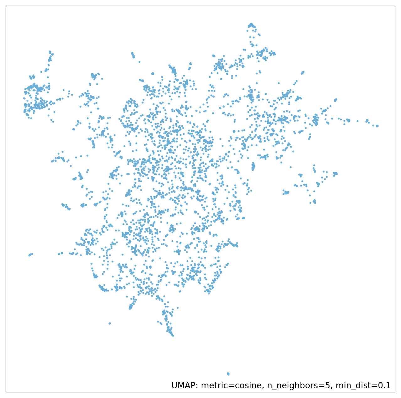
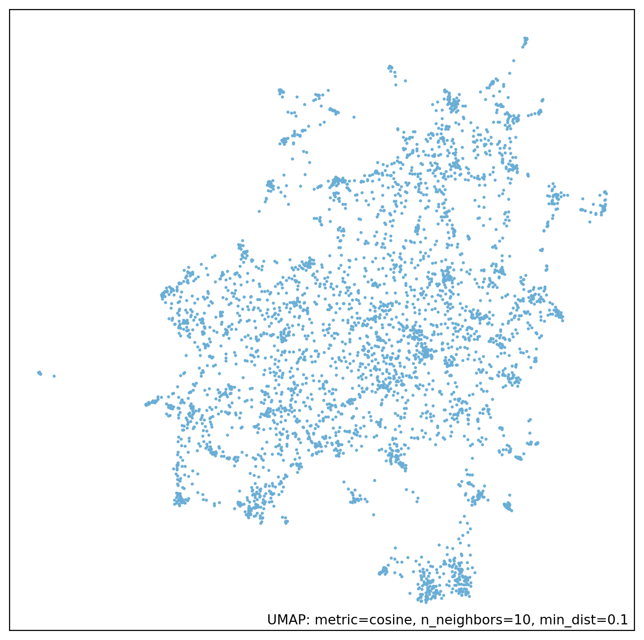
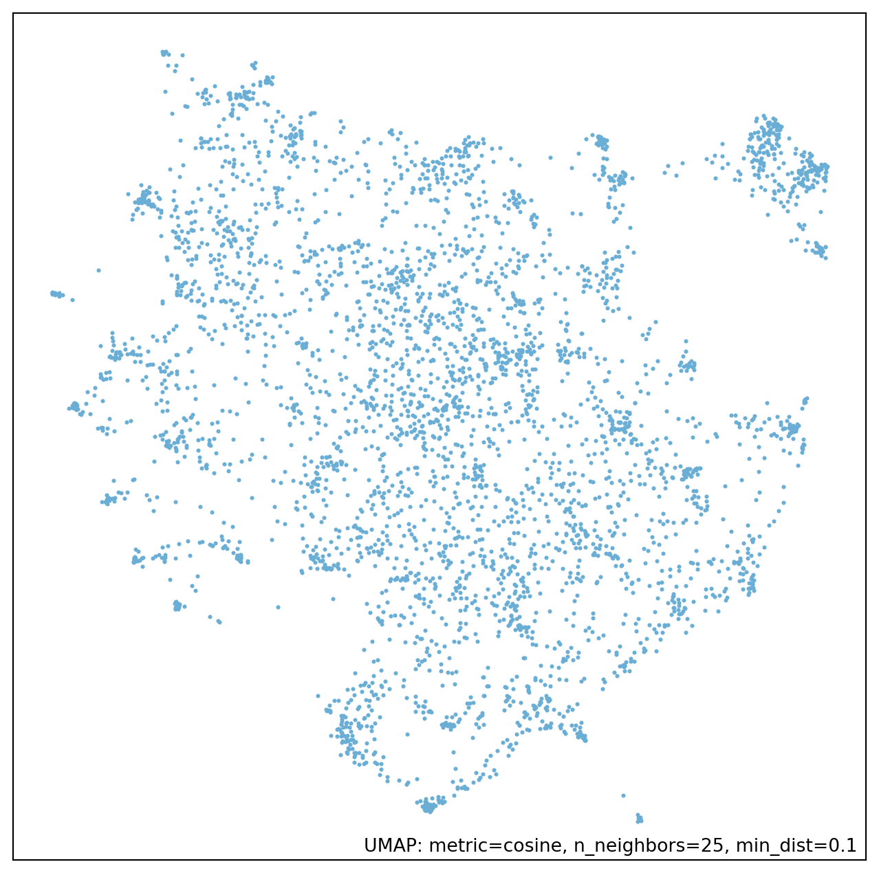
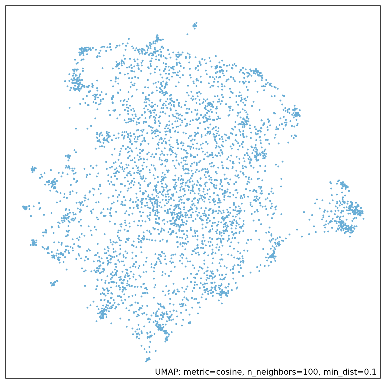
My not close to expert understanding of it is that the algorithm is about identifying points that are near to each other to build a graph of the data. This graph is then collapsed into a lower dimension space while trying to preserve this graph as much as possible. This highlights a few parameters that must be set: n_neighbors, min_dist, and n_components. n_components is the simplest to explain, as it is the number of dimensions you want in the final space. min_dist controls how close points can be at the very end. If this is set to 0 then points that are close in the initial space will be in the exact same spot in the final space. The default is 0.1. n_neighbors is the most abstract as it controls how many points are initially connected to each other when the graph is first made. As the documentation describes, this has a local/global tradeoff. Small values will just capture information about points that are immediately near to each other, as it gets larger more information about the global space will be captured. In Figure 1 I’ve estimated four different lower dimensional embeddings using different values of n_neighbors. You can see here that with this set to 5 there are a lot of very small clumps, whereas this smooths out as you increase n_neighbors.
After reducing dimensionality the next step is to cluster your data. Again, it is possible to do this using a variety of algorithms. The default (or suggested) is HDBSCAN. This algorithm is again somewhat complicated, especially if you are unfamiliar with hierarchical clustering in general. The developers have a useful explanation here. There are some similarities with UMAP here as both involve graphs and thinking about sparsity/density. An important step for HDBSCAN is building the minimal graph between all points. Before that though it is useful to make some adjustments that will lower the effects of random noise in the data.
HDBSCAN starts by defining a mutual reachability distance which is the maximum of the actual distance between two points, and the “core distance” of each point (defined as how far away the kth-nearest point is). This means that for points that are in relatively sparse areas (with a large core distance) they will be pushed away from any nearby points. Points that are around a lot of points (so have a smaller core distance) are not as adjusted. The first parameter then that needs to be set is min_samples which controls how many points are used to create the core distance. The higher that value the larger the mutual reachability distance will be, on average, and so points will be “further” from each in the clustering stage. This leads to more conservative clustering (more “noise” is identified).
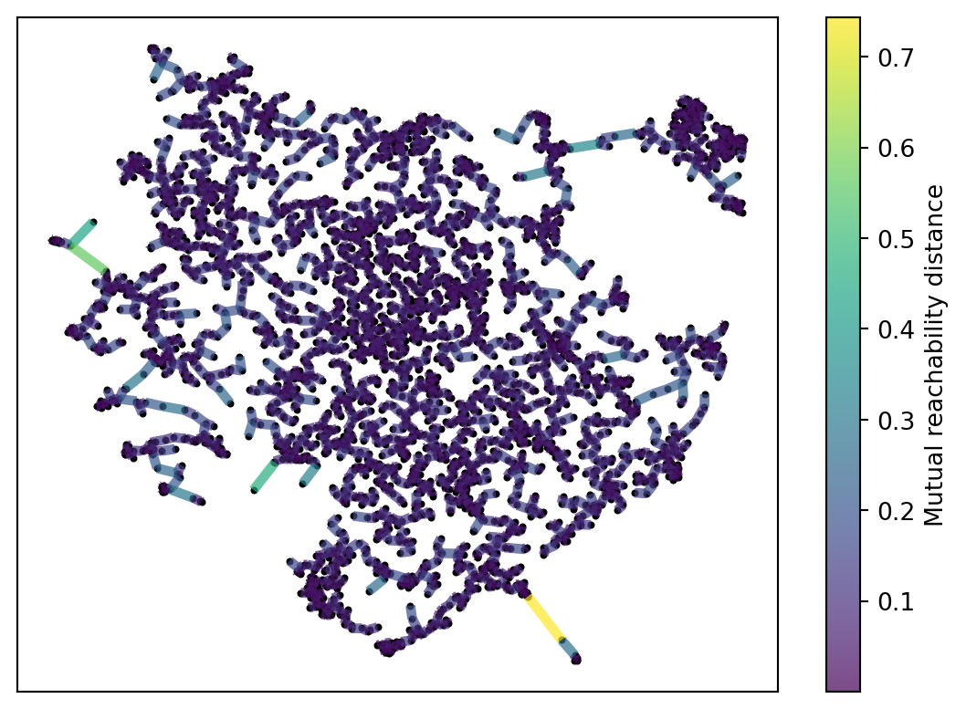
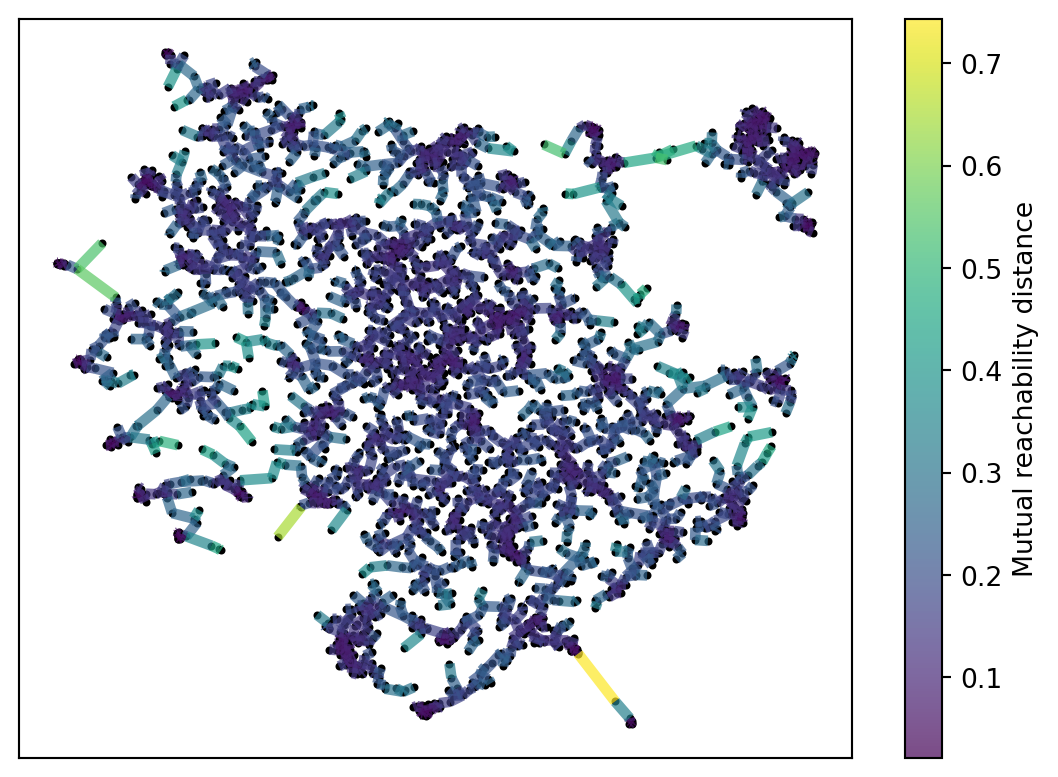
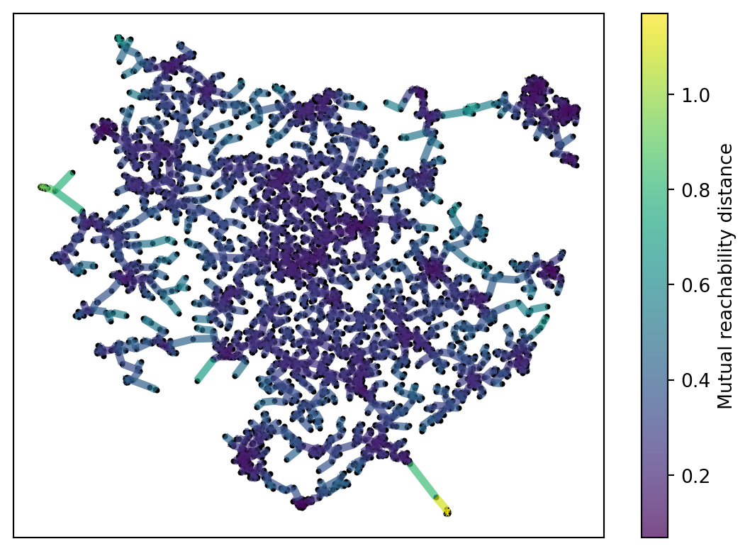
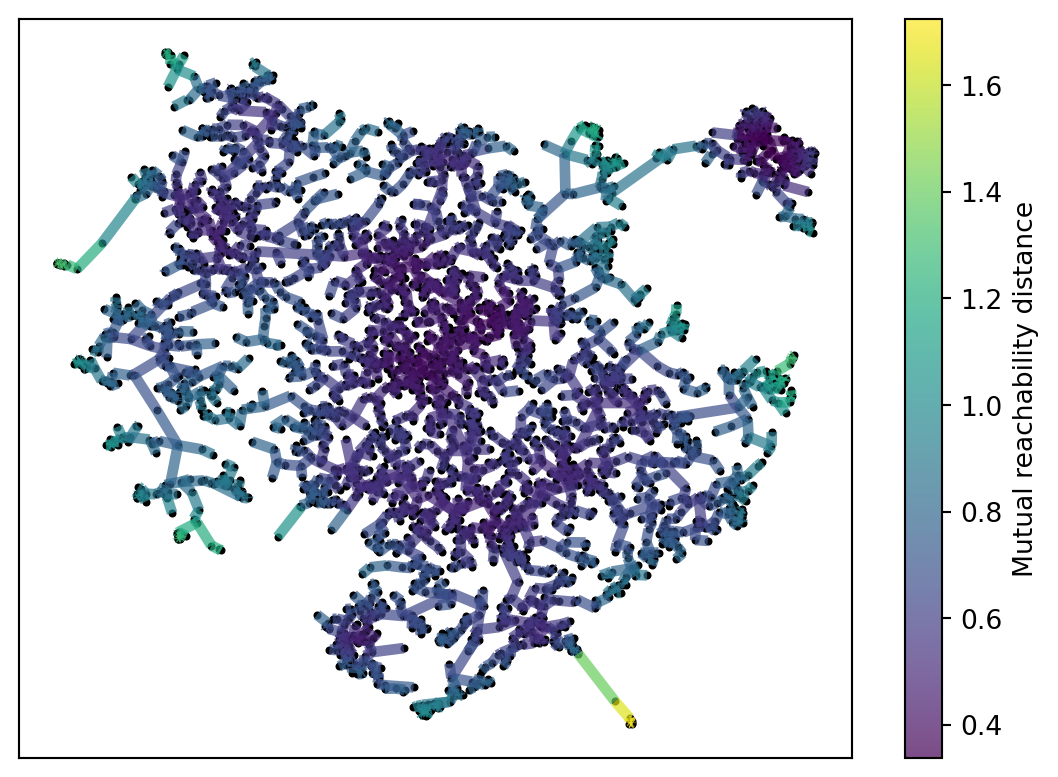
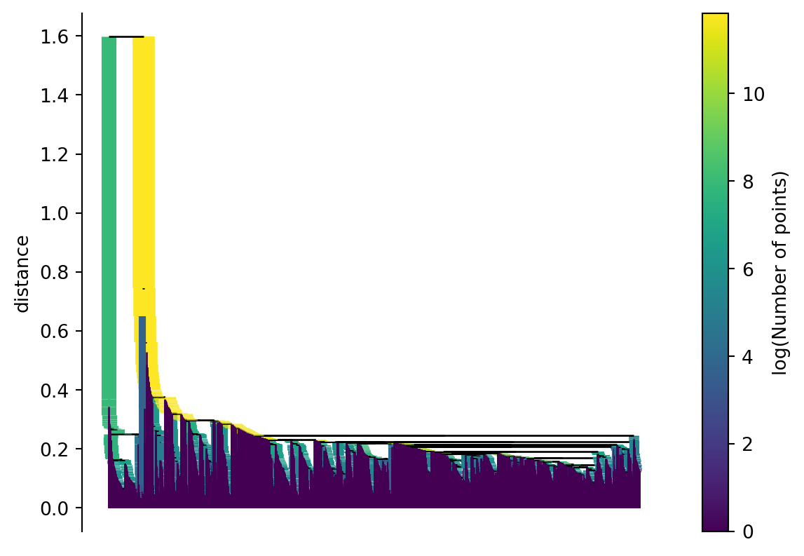
After this, a minimal spanning tree is created. This is the smallest graph/network that connects every observations. The distances mutually reachability is used to create this network. In Figure 2 I show how different values of min_samples change the minimal spanning tree. In particular you see that different values min_samples leads to different connections to groups of nodes on the outside.
Figure 2: Spanning Tree with Different HDBSCAN Parameters
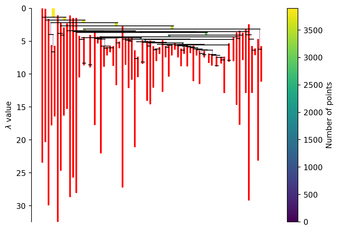
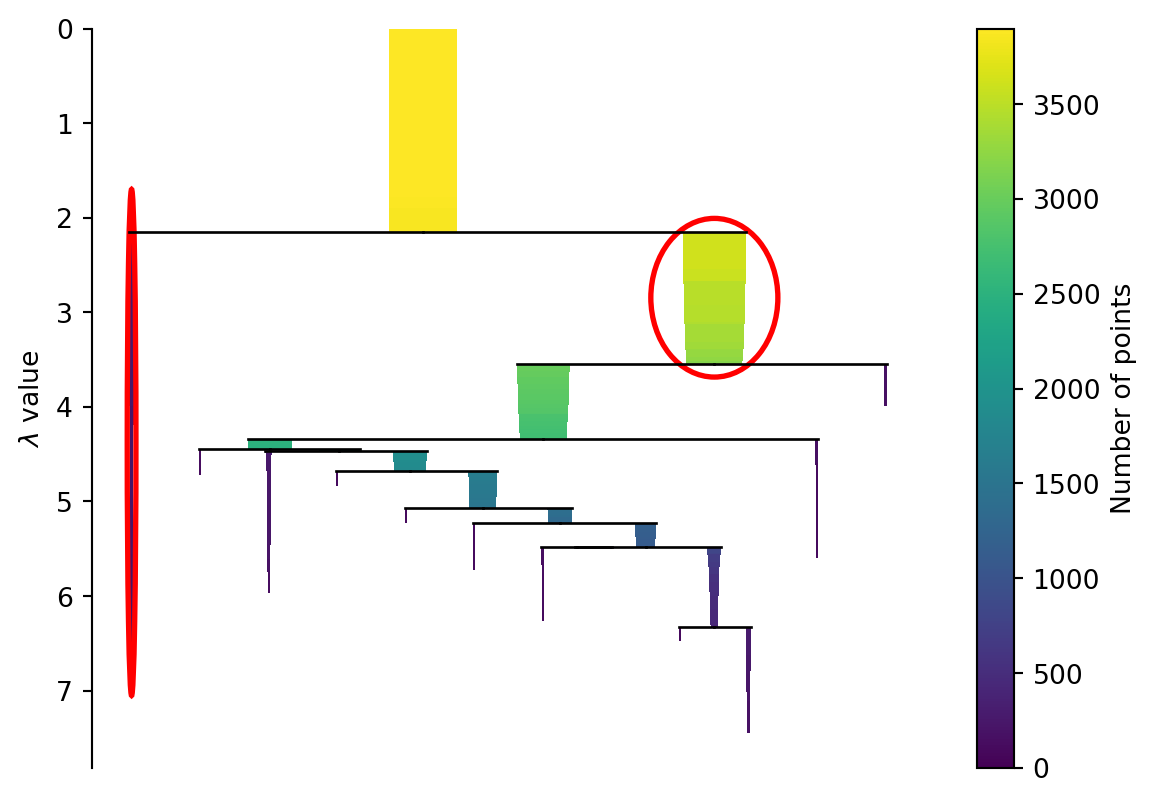
At this point you can create a hierarchical cluster of your observations. This is done by combining points together that are close in the spanning tree. Iterating this process over and over creates a dendrogram. Figure 3 shows an example dendrogram.
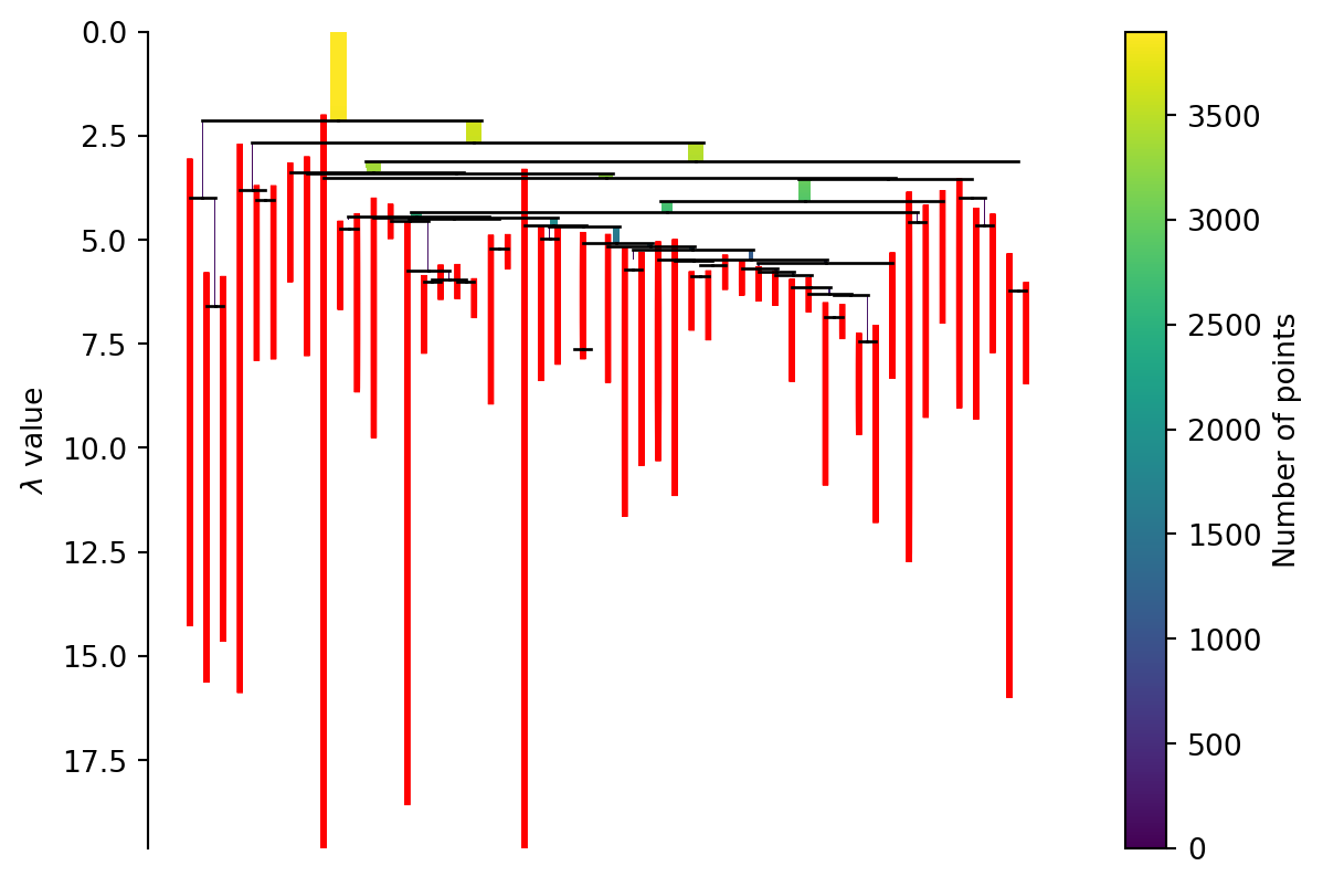
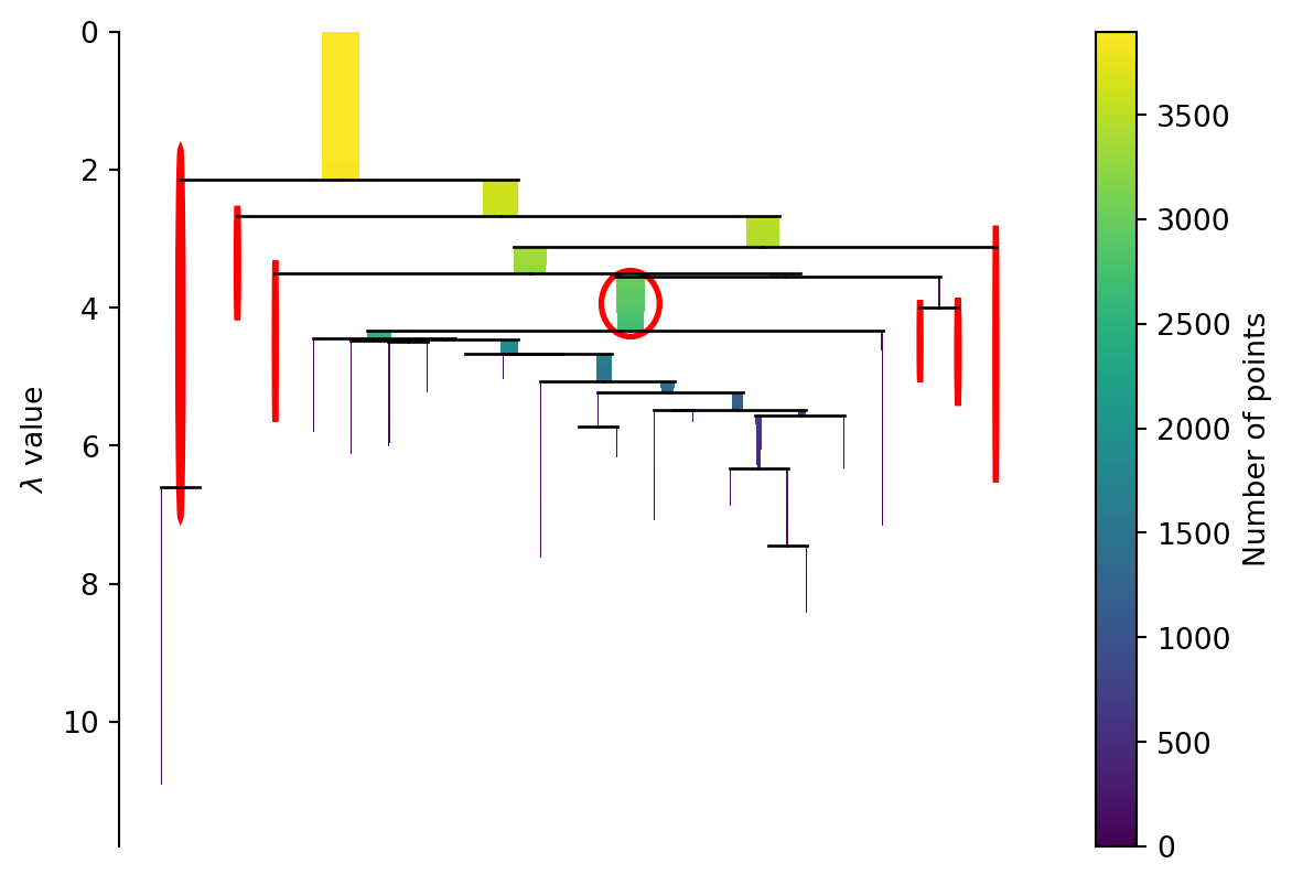
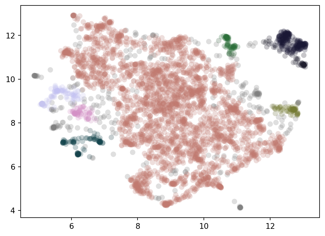
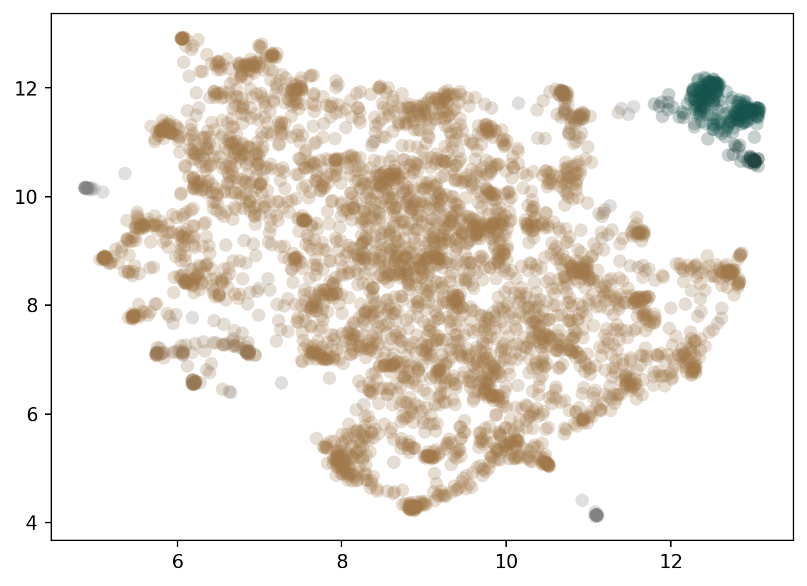
We could cut the tree at some point and create our clusters this way. HDBscan takes a different approach here. Instead we apply a minimum cluster size to it. Every time a cluster splits we look to see if the clusters created are above the minimum size or not. If only one is but the other isn’t then we treat the larger as a continuation of the original cluster which is now smaller. If both are larger than we treat them as two new clusters. In Figure 4 you can see the effect of different minimum cluster sizes. As a final step we select the clusters that “last the longest” in this process (but only if they don’t have any clusters below them we want to select).
import seaborn as snsdef plot_clusters(min_samples, min_cluster_size, embeddings): clusterer = hdbscan.HDBSCAN(min_samples=min_samples, gen_min_span_tree=True, min_cluster_size=min_cluster_size,approx_min_span_tree=False) clusterer.fit(embeddings) color_palette = sns.color_palette('cubehelix', int(max(clusterer.labels_))+2) cluster_colors = [color_palette[x] if x >=0else (0.5, 0.5, 0.5)for x in clusterer.labels_] cluster_member_colors = [sns.desaturate(x, p) for x, p inzip(cluster_colors, clusterer.probabilities_)] plt.figure() plt.scatter(low_dim.embedding_[:,0], low_dim.embedding_[:,1], s=50, linewidth=0, c=cluster_member_colors, alpha=0.25) plt.show()plot_clusters(min_samples=10, min_cluster_size=50, embeddings=low_dim.embedding_)plot_clusters(min_samples=10, min_cluster_size=100, embeddings=low_dim.embedding_)
(a) Minimum Cluster Size: 50
(b) Minimum Cluster Size: 100
Figure 5: Final Clusters with Different Minimum Sizes
Combining, Weighting and Describing
After the clusters have been identified the final step is to create useful explanations of those clusters. This starts by combining all the documents of a cluster together. This document is then tokenized. At this point the terms are weighted based on how unique they are to the topic compared to how common they are across all topics. This is a type of tf-idf weighting. Finally, you can use a variety of other models to create better representations of the categories. For example, you can feed representative documents and keywords to an LLM and ask it to create a label.
Setting Up and Running BERTopics
The whole point of BERTopics though is that you do not have to do each of these parts step by step. Instead you can use the package which allows you to easily combine each step together (and provides a lot of flexibility). The code below sets this up as the following model:
I use the “all-MiniLM-L6-v2” to embed my open-ended responses. I also calculate the embeddings ahead of time so I can use them later as necessary.
I will use UMAP to collapse it into 5 dimensions. I select 25 neighbors (I’ve found BERTopics to be less sensitive to the parameters for UMAP than parameters for HBDScan)
I use HDBscan to find the clusters. I want relatively large clusters so set the minimum cluster to 50. This will probably create a fair number of outliers, one way I reduce that is by setting the minimum number of samples to 10.
To help understand the topics I am going to use BERTopics KeyBERTInspired function. More details on this are here.
There are other things I could do, like change the weighting or the way it tokenizes texts at the end but I will leave those as is.
You can access the topics and their description by calling .get_topic_info() (table_display() is a function I wrote to make the table display nicer in Quarto). Note the first topic (-1) are the “outliers”. There are ways you can incorporate them into nearby topics if you’d like.
table_display(topic_model.get_topic_info())
Topic
Count
Representation
Representative_Docs
Loading ITables v2.2.4 from the internet...
(need help?)
It is also possible to visualize the topics in a lower dimensional space.
It seems only fair to do this for Trump as well. I reduce the minimum cluster size here to 25 and the minimum samples to 5. When I had them at the original values it tended to create 1 very large cluster.
Topics
Code
table_display(topic_model.get_topic_info())
Topic
Count
Representation
Representative_Docs
Loading ITables v2.2.4 from the internet...
(need help?)