Bar Charts in Google Sheets
Making bar charts in Google Sheets from a pivot table isn’t too hard, but there are some things you need to consider ahead of time that will make your life easier:
- There isn’t any native way to rearrange categories once they’ve been added to the chart, so you need to make sure your data is in order prior to creating your chart.
- Related, you will want to make sure that any categories are combined prior to making your chart.
- Google Sheets has a fairly limited number of chart options, and some things require a fair amount of manual editing to make them look nice.
Prepping Data
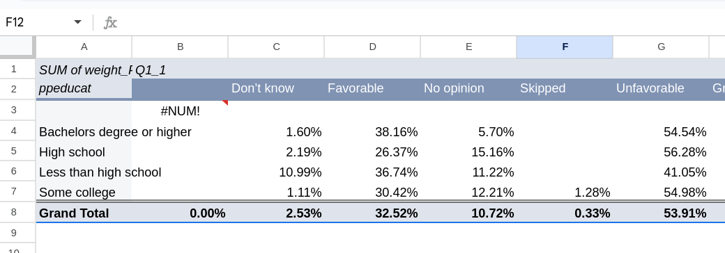
I am starting here with a pivot table between two Q1_1 and ppeducat. I’ve calculated the values as row percentages. See Figure 1. One thing we want to do is deal with the relatively empty columns by combining them together into a single category.
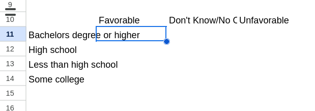
I’ll start by creating a table below that has the current rows in the pivot table (you can drop some at this point if you want) and has the columns that I eventually want (not the columns in the pivot table). Keep the rows in the order of the pivot table, but put the columns in a logical order. See Figure 2 for how I’ve started.
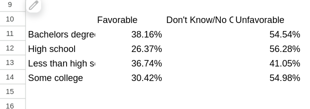
We can start by just copying in the two columns that aren’t changing (the favorable and unfavorable).
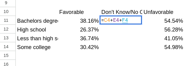
In order to create the Don’t Know/No Opinion category we need to combine multiple columns from our pivot table. The easiest way here to do this is by using a function to add each cell in that column. For the Bachelor’s Degree row that will be: =C4 + E4 + F4 (Figure 4). Once you have that formula in the first row you can drag it down the rest of the column.
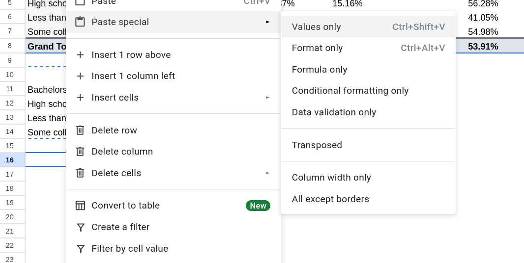
Now that we have our table setup we want to rearrange the rows so they are in a logical order. If we rearrange them as they are currently then the formulas would also update. One easy way to deal with this is to copy and paste our new table but when we paste it, do a “Paste special” and select “Values only” (Figure 5). This only copies over the values of what we’ve selected and leaves the formulas behind.
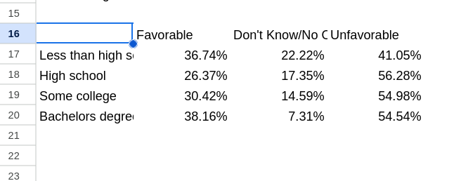
Finally we can cut and paste the rows until they are in an order that makes logical sense (Figure 6).
Making Your Plot
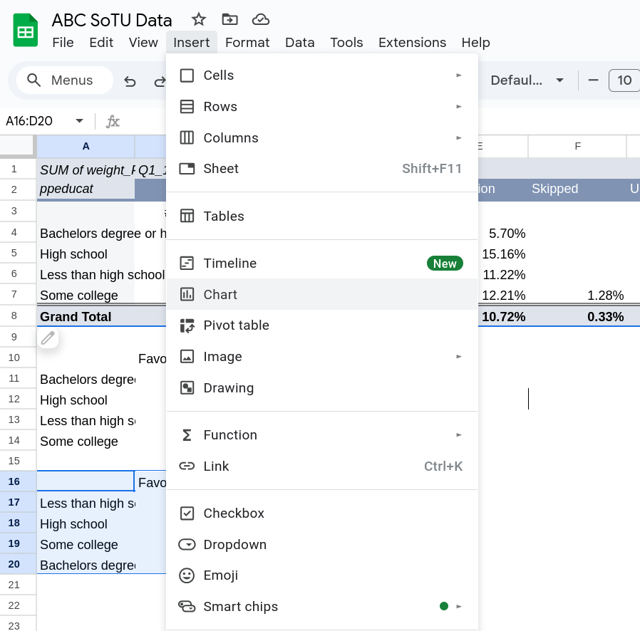
Making your plot is easy now. Highlight the table we made (including the labels) and go to “Insert” and then select “Chart.” You should now have a bar plot.
If you want to edit the type of chart there should be a window on the right that shows you different options. Select whatever you’d like. For this example we are going to stick with the stacked bar chart.
It is often helpful to add the labels to the bars. To do this select the Customize tab on the chart menu on the right.1 Go to the “Series” section. Near the bottom of that section check the “Data labels” box. A new menu will open up, if you want to center the labels pick Center from the Position dropdown. See Figure 8
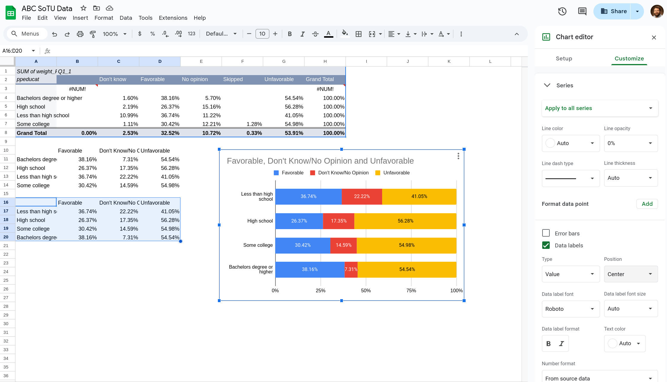
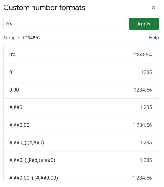
It defaults to showing the labels in the format that you have in the table it is drawing the data from. If you want to change them to not show as many digits you need to highlight your original data and select Format \(\rightarrow\) Number \(\rightarrow\) Custom format number. A box will pop up (Figure 9) that lets you select a format for the numbers. To select percentages with no decimal points write “0%” (IF you wanted just one decimal point you’d write “0.0%”, for two “0.00%”, etc).
There are a few other things you can do:
- If you’d like to change the theme/colors. Select the plot and then go to Format \(\rightarrow\) Theme. You’ll have options that pop up in the menu on the right.
- To move the legend position, in the chart editor go to Customize \(\rightarrow\) Legend and then use the Position dropdown.
- You can customize particular colors by going to Customize \(\rightarrow\) Series and then selecting a particular category from the first dropdown. You can then edit how that is displayed.
- To edit the title double click on it. You can do the same with other labels.
- You can also switch if the rows are on the axis and the columns the fill by going to Setup. Scroll to the bottom and check the “Switch rows / columns” box.
To download the plot click the three dots on the top right and select “Download Chart”. It will provide a few different options. A PNG is probably most common, while SVG will look the best. @final-plot is the SVG version of what I have made.

Footnotes
If the plot menu ever vanishes click on the plot and click the three dots on the top right of the plot. Select the edit option and the menu will pop back up.↩︎